Ocado Header Redesign
a 1 week project to re-design UK online grocery retailer Ocado's e-commerce header
1 week -Solo
2023
User Interface
Ocado Header Redesign
a 1 week project to re-design UK online grocery retailer Ocado's e-commerce header
1 week -Solo
2023
User Interface
Ocado Header Redesign
a 1 week project to re-design UK online grocery retailer Ocado's e-commerce header
1 week -Solo
2023
User Interface
Project Overview
Project Overview
Project Overview
Discover
Competitive analysis
Market research
Define
Primary data collection
Synthesise key findings
Feature prioritisation matrix
Design
Low-fi sketches
High-fi prototypes
Deliver
Improvement suggestions
Discover
Competitive analysis
Market research
Define
Primary data collection
Synthesise key findings
Feature prioritisation matrix
Design
Low-fi sketches
High-fi prototypes
Deliver
Improvement suggestions
Discover
Competitive analysis
Market research
Define
Primary data collection
Synthesise key findings
Feature prioritisation matrix
Design
Low-fi sketches
High-fi prototypes
Deliver
Improvement suggestions
Competitors
Features
Tesco

Sainsbury's
Waitrose
Asda
favourite tabs
Promotion tabs
basket icon/button
Book delivery
Register button
Dropdown box for specified search
Search bar
Log in/ sign in
Help Centre
promoting partner brands
Hover to dropdown menu
Competitive Analysis
I started off by identifying the key features/components used by Ocado's key competitors in grocery retail sector


Change the way the world shops for good (and better),
this can be achieved with a brand-new header!
Change the way the world shops for good (and better),
this can be achieved with a brand-new header!
Change the way the world shops for good (and better),
this can be achieved with a brand-new header!
Before
Before
Before


After
After
After


Jakob's Law
Jakob's Law
Jakob's Law
" Users spend most of their time on other sites. This means that users prefer your site to work the same way as all the other sites they already know."
" Users spend most of their time on other sites. This means that users prefer your site to work the same way as all the other sites they already know."
" Users spend most of their time on other sites. This means that users prefer your site to work the same way as all the other sites they already know."
Competitive Analysis
Competitive Analysis
Based on Jakob's Law, I started this project by identifying the key features/components used by Ocado's competitors in their headers. Assuming that the competitors would also have done some form of UX research on their end to inform their design decisions, this overview gave me a good indicator of what features grocery shoppers and retailers generally find valuable and, therefore, worth prioritising.
Based on Jakob's Law, I started this project by identifying the key features/components used by Ocado's competitors in their headers. Assuming that the competitors would also have done some form of UX research on their end to inform their design decisions, this overview gave me a good indicator of what features grocery shoppers and retailers generally find valuable and, therefore, worth prioritising.
Feature names
Feature names
Tesco
Tesco

Sainsbury's
Sainsbury's
Waitrose
Waitrose
Asda
Asda
Search bar
Search bar
Log in/sign in button
Log in/sign in button
Help centre
Help centre
Promoting partner brandes
Promoting partner brandes
Dropdown box for specified search
Dropdown box for specified search
Register button
Register button
Book delivery
Book delivery
Basket icon/button
Basket icon/button
Promotions tab
Promotions tab
Favourites tab
Favourites tab
Hover to dropdown menu
Hover to dropdown menu
Secondary and Primary Research
Secondary and Primary Research
Secondary and Primary Research
Based on Trust Pilot reviews, I could validate my assumptions of the website being 'messy' and difficult to navigate – calling for the need of a more user-friendly and cleaner UI.
Based on Trust Pilot reviews, I could validate my assumptions of the website being 'messy' and difficult to navigate – calling for the need of a more user-friendly and cleaner UI.
Based on Trust Pilot reviews, I could validate my assumptions of the website being 'messy' and difficult to navigate – calling for the need of a more user-friendly and cleaner UI.
What is not working?
What is not working?
What is not working?


I also conducted a primary research study with my Instagram followers. Most of them are either Gen Zs or millennials. According to the secondary research I carried out, these two consumer groups are most likely to order groceries online. The aim of this poll was to understand what the regular shopper value the most in a header and why so.
I also conducted a primary research study with my Instagram followers. Most of them are either Gen Zs or millennials. According to the secondary research I carried out, these two consumer groups are most likely to order groceries online. The aim of this poll was to understand what the regular shopper value the most in a header and why so.
I also conducted a primary research study with my Instagram followers. Most of them are either Gen Zs or millennials. According to the secondary research I carried out, these two consumer groups are most likely to order groceries online. The aim of this poll was to understand what the regular shopper value the most in a header and why so.
What is working already?
What is working already?
What is working already?


Key Findings
Key Findings
Key Findings
Unsurprisingly, clutter was among the most common reasons to down-vote a retailer's header while a clear search bar was something many shoppers valued.
Unsurprisingly, clutter was among the most common reasons to down-vote a retailer's header while a clear search bar was something many shoppers valued.
Unsurprisingly, clutter was among the most common reasons to down-vote a retailer's header while a clear search bar was something many shoppers valued.
No to Clutter!
No to Clutter!
No to Clutter!


"Sainsbury's is too cluttered with all the colours and icons
"Sainsbury's is too cluttered with all the colours and icons


"Tesco is easiest to navigate and you can see where everything is"
"Tesco is easiest to navigate and you can see where everything is"
Yes to clear search bar!
Yes to clear search bar!
Yes to clear search bar!


"I think waitrose bc the search bar is more visible than Tesco's"
"I think waitrose bc the search bar is more visible than Tesco's"


"I choose Waitrose, I like that the first thing you see is the search bar!"
"Tesco is easiest to navigate and you can see where everything is"
The winner in my Instagram story poll was Waitrose and the less lucky one was Sainsbury - criticised for being too cluttered. It seems that the concept of "less is more" goes for online grocery headers as well!
The winner in my Instagram story poll was Waitrose and the less lucky one was Sainsbury - criticised for being too cluttered. It seems that the concept of "less is more" goes for online grocery headers as well!
The winner in my Instagram story poll was Waitrose and the less lucky one was Sainsbury - criticised for being too cluttered. It seems that the concept of "less is more" goes for online grocery headers as well!
Looser: Sainsbury's
Looser: Sainsbury's
Looser: Sainsbury's


Winner: Waitrose
Winner: Waitrose
Winner: Waitrose


Case study: No to Register Button
Case study: No to Register Button
Case study: No to Register Button
Another interesting finding I came across, was a case study unfolding shoppers' resistance to the register button. Many shoppers in this study felt that businesses were trying to invade their privacy and that the registration process disrupted their shopping experience. With this feedback, the e-commerce gave the shoppers the option to register, a solution similar to this one found on ASDA's website. Turns out that a simple re-design like this generated an additional $300 million for the business.
Another interesting finding I came across, was a case study unfolding shoppers' resistance to the register button. Many shoppers in this study felt that businesses were trying to invade their privacy and that the registration process disrupted their shopping experience. With this feedback, the e-commerce gave the shoppers the option to register, a solution similar to this one found on ASDA's website. Turns out that a simple re-design like this generated an additional $300 million for the business.
Another interesting finding I came across, was a case study unfolding shoppers' resistance to the register button. Many shoppers in this study felt that businesses were trying to invade their privacy and that the registration process disrupted their shopping experience. With this feedback, the e-commerce gave the shoppers the option to register, a solution similar to this one found on ASDA's website. Turns out that a simple re-design like this generated an additional $300 million for the business.


Register = A hassle
" I'm not here to enter into a relationship, I just want to buy something"
Register = A hassle
" I'm not here to enter into a relationship, I just want to buy something"
First time & returning shoppers actively avoided to register
“Invading privacy” / Email Spam / inconvenient
The register process was preventing sales
Generated an additional $300 million in the first year
First time & returning shoppers actively avoided to register
“Invading privacy” / Email Spam / inconvenient
The register process was preventing sales
Generated an additional $300 million in the first year
First time & returning shoppers actively avoided to register
“Invading privacy” / Email Spam / inconvenient
The register process was preventing sales
Generated an additional $300 million in the first year
Solution: Let me shop
Solution: Let me shop
Solution: Let me shop


Feature and label prioritisation
Feature and label prioritisation
Feature and label prioritisation
“Favourites” tab is usually only visible in a secondary header after login
Important to promote partner brands without causing clutter
Important to promote offers without causing clutter
Promotion more suitable on the website as it is not static
“Favourites” tab is usually only visible in a secondary header after login
Important to promote partner brands without causing clutter
Important to promote offers without causing clutter
Promotion more suitable on the website as it is not static
“Favourites” tab is usually only visible in a secondary header after login
Important to promote partner brands without causing clutter
Important to promote offers without causing clutter
Promotion more suitable on the website as it is not static
Low-fi sketching
Low-fi sketching
Low-fi sketching
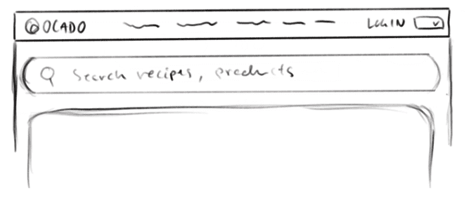
Inspired by other grocery websites, I quickly drew a few potential header designs for Ocado.
Inspired by other grocery websites, I quickly drew a few potential header designs for Ocado.
Inspired by other grocery websites, I quickly drew a few potential header designs for Ocado.


Recommendations
Recommendations
Recommendations
🌟 Design Principles
Design Principles
#1 Reduce Clutter
#1 Reduce Clutter
#1 Reduce Clutter
Improvements
Improvements
Added more white space & margins
Reduced clutter & confusion
prioritised important information to help users make quick decisions
Reduce cognitive load
Added more white space & margins
Reduced clutter & confusion
prioritised important information to help users make quick decisions
Reduce cognitive load
Added more white space & margins
Reduced clutter & confusion
prioritised important information to help users make quick decisions
Reduce cognitive load
Design principles
Design principles
Design principles


#2 Search bar - CTA
#2 Search bar - CTA
#2 Search bar - CTA
Improvements
Improvements
Expanded the search bar size for greater visibility, added “recipes” in the search bar
Expanded the search bar size for greater visibility, added “recipes” in the search bar
Expanded the search bar size for greater visibility, added “recipes” in the search bar
Design principles
Design principles
Design principles


#3 Log-in Button
#3 Log-in Button
#3 Log-in Button
Improvements
Improvements
Added icon for improved usability & to eliminate language barriers.
The button was repositioned to the righthand side to align with external standards, matching users’ expectation
Added icon for improved usability & to eliminate language barriers.
The button was repositioned to the righthand side to align with external standards, matching users’ expectation
Added icon for improved usability & to eliminate language barriers.
The button was repositioned to the righthand side to align with external standards, matching users’ expectation
Design principles
Design principles
Design principles


#4 Category Banner
#4 Category Banner
#4 Category Banner
Improvements
Improvements
Re-labelled the horizontal category banner, increased the font size for improved readability and replaced “hover to dropdown” with “click to dropdown”
Re-labelled the horizontal category banner, increased the font size for improved readability and replaced “hover to dropdown” with “click to dropdown”
Re-labelled the horizontal category banner, increased the font size for improved readability and replaced “hover to dropdown” with “click to dropdown”
Design principles
Design principles
Design principles


OCADO SANS
OCADO SANS
OCADO SANS
/ Font family
ABCDEFGHIJKLMNOPQRSTUVWXYZ
ABCDEFGHIJKLMNOPQRSTUVWXYZ
ABCDEFGHIJKLMNOPQRSTUVWXYZ
abcdefghijklmnopqrstuvwxy
abcdefghijklmnopqrstuvwxy
abcdefghijklmnopqrstuvwxy
0123456789
0123456789
0123456789
Background white
#FFFFFF
Blue Grey
##EEF2F5
Promotion red
#C31B25
Ocado Purple
#4E206E
💭 Reflections
I'm very satisfied with the outcome despite the short timeline and limited resources for carrying out thorough user testing.
💭 Reflections
I'm very satisfied with the outcome despite the short timeline and limited resources for carrying out thorough user testing.
💭 Reflections
I'm very satisfied with the outcome despite the short timeline and limited resources for carrying out thorough user testing.